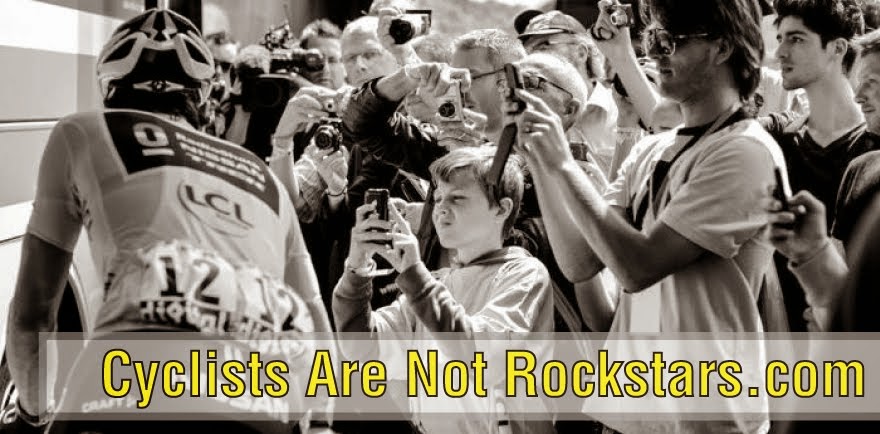
It's time for the annual Rockstar Team
Kit Review. It's late this year due to the fact that a lot of the
teams held out releasing the final products till the last possible
minute. We are blaming a couple of things for that:
#1-The need to finalize sponsors right up to
the deadline.
#2-A clearly confused state of what's
in-style for cycling jersey design. (Besides the “Leopard
Layercake” look).
So fans are left with fewer new jerseys
to analyze then last year, but we still have a couple of doozies...
Here goes!
 |
Starting off with the most anticipated
jersey of 2012 is GreenEdge. A lot of uglier designs were
leaked\conceptualized in the previous 4 months or so. What we
actually got was an attractive jersey that may be the best of the
Layercakes 2012. Somehow the shorts save this kit from boring-ness
Grade B+
|
 |
Saxo Bank rolls into 2012 with a bold
new color and a backside re-design. All joking aside, this kit takes
“Most Improved” by a long shot and the bold backview
will make these guys standout among all the others. Bonus points
because Alberto Contador comes into the season an underdog somehow
and everyone loves an underdog....
Grade A-
|
 |
Among the ProTeams the new Lotto kit is the boldest
departure from 2011's look. Too bad cause last
year's scored pretty high. Still, the new design looks good and just
cluttered enough. Kit designers should print this out, tape it on
their wall and repeat the following phase over and over:
“If my design is busier then this,
take stuff out...If my design is busier then this, take stuff out...”
Grade B+
|
 |
The Lampre Kit goes thru minor changes
that will continue to assure its place high up on the “Confusing to
Non-cycling Fans” list.
Note that this is the only shot where we've
kept in the rider's face....
Thanks Pettacchi.... You just can't
ignore cool like that.
Grade C-
|
 |
Omega Pharma left Lotto at the end of
2011 and took the "cool" with them in their merger with QuickStep. This
kit looks good. It's not quite layercake but it definitely draws from
that aesthetic without being obvious. It ends up perhaps taking the best-of-show award.
Grade A+
|
 |
Here's Garmin Barracuda.... Cervelo and
their hatred of argyle is out, Barracuda's cheesy fish logo is in.
Fans
get another layercake to eat up.
Grade B-
|
 |
The other front runner for 2012's “Most Improved” was Katusha. It looks good but can't be considered best-of-show cause it's another variation of the Layercake
that tricks you into thinking you are looking at something with originality.
Go Menchov!
Grade A-
|
 |
Maybe Layercake is ultimately the best.....
Confidis is the one team that has moved
away from the horizontal-lines look and instead has come up with this
cheerleader's nightmare of an outfit. Ugly... And the worst of 2012.
Grade F
|
 |
Saving the all-stars at Radioshack\Trek\Leopard
Mercedes\Johan\Schleck Bros\Nike\Nissan for last...
Last year Team Leopard Trek was praised and bashed
for their minimalist approach to kit design. Love it or hate it,
it was a theme that was appropriate for the stylish new team
from Luxembourg.
It was a look that should have lasted 1 year.
With the addition of an entire american-flavored team,
this new super-team really did deserve a complete re-do.
Instead they got this...
The blacked-out Trek's they'll be riding are the only thing that helped them get a passing grade.
Grade D+ |
|
|
|
|
Team that will ride with kits unchanged enough to not care:
BMC
Movistar
Rabobank
Vacansoleil
Sky
Liquigas
Francis de Jeux
Be sure to leave your thoughts below.


